

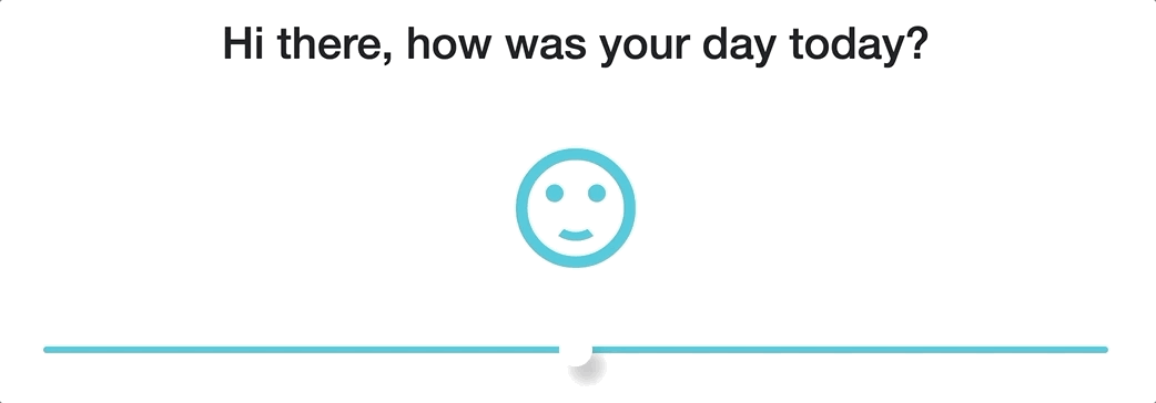
In my quest to learn more about Blazor I've started of a small toy project I had in my head for quite a while. One of the first steps for was to create a mood slider. Of course I'm a sloth so I searched for something that had already been created. Lucky me I found a beautiful example of what I wanted to achieve on this post, thanks Minali.
Although I could use this example as is but that would be counter intuitive, I could go as well and create a classic web app. So I made it a component. For my purposes so far I have kept the CSS in the component file while I'm evaluating possible the other options (like BlazorStyled). Icons are based on material icons font.
After creating a Components folder and adding the necessary using statement to _Imports.razor file, time for the component.
Starting with the @code part. The component access a string parameter for the Color property, notice the [Parameter] attribute. An integer to hold the start value of the slider and an array that contains the values of the five icons I'm using.
@code{

	[Parameter]
	public string Colour {get;set;}
 	public int CurrentIndex = 2;
	public string[] Emoticons = new []
	{
		"mood_bad",
		"sentiment_very_dissatisfied",
		"sentiment_satisfied",
		"sentiment_satisfied_alt",
		"sentiment_very_satisfied"
	};

private void SetCurrentIndex(ChangeEventArgs e) => CurrentIndex = int.Parse(e.Value.ToString()) ;

}
Also the SetCurrentIndex(ChangedEventArgs e) method which is self descriptive. Since I will call this method from the onInput event I have added the ChangedEventArgs event as a parameter to hold the information passed. Here is a comprehensive list for which type of event you should use.
While this works, it's not ideal, it's been ages since I last used a set method and better ways for binding have been created. But this was a good way to introduce how to bind a to function and pass the event. Now I'll remove SetCurrentIndex method and the binding will happen on the HTML side.
The HTML part of it
	<div class="container">
		<i class="material-icons">
		@Emoticons[CurrentIndex]
		</i>
		<input type="range" min="0" max="4" @bind="CurrentIndex" >
	</div>
The CSS part of it
<style>

body{
	padding: 0;
	margin: 0;
}
.container{
	height: 30vh;
	width: 50vw;
	display: flex;
	align-items: center;
	justify-content: center;
	flex-direction: column;
}
input[type="range"]{
	width: 50vw;
	height: 6px;
	-webkit-appearance:none;
	background-color: @Color;
	border-radius: 6px;
	outline: none;
	margin-top: 60px;
}
input[type="range"]::-webkit-slider-thumb{
	-webkit-appearance:none;
	height: 30px;
	width: 30px;
	background-color: white;
	border-radius: 50%;
	box-shadow: 10px 15px 10px rgba(0,0,0,0.2);
}
.material-icons{
	font-size: 130px;
	color: @Color;
}
</style>
Four things to notice here
1) Accessing the Emoticons array and using it's value based on the CurrentIndex property
2) The way the SetCurrentIndex is assigned to the oninput event
3) @bind="CurrentIndex", the value does not need to be set explicitly, instead the <input> value binds to the CurrentIndex property.
4) The Colour parameter is passed from the component call down to CSS property of the material-icons class
Last part is to include the component in Index.razor page and include the material icons font in the _Host.cshtml file.
<link href="https://fonts.googleapis.com/icon?family=Material+Icons" rel="stylesheet">
Remember the Colour parameter?
<MoodSlider Colour="#3fcad8"/>As my background lies in backend development my opinion is not very objective, rather biased I'd say. Having worked with React on work projects I'd like to see if Blazor can tackle issues people faced with react. Of course it goes without saying it feels good to have the .Net Experience.
I'll watch my words though as it's too early.
Thanks for reading :)
Comments